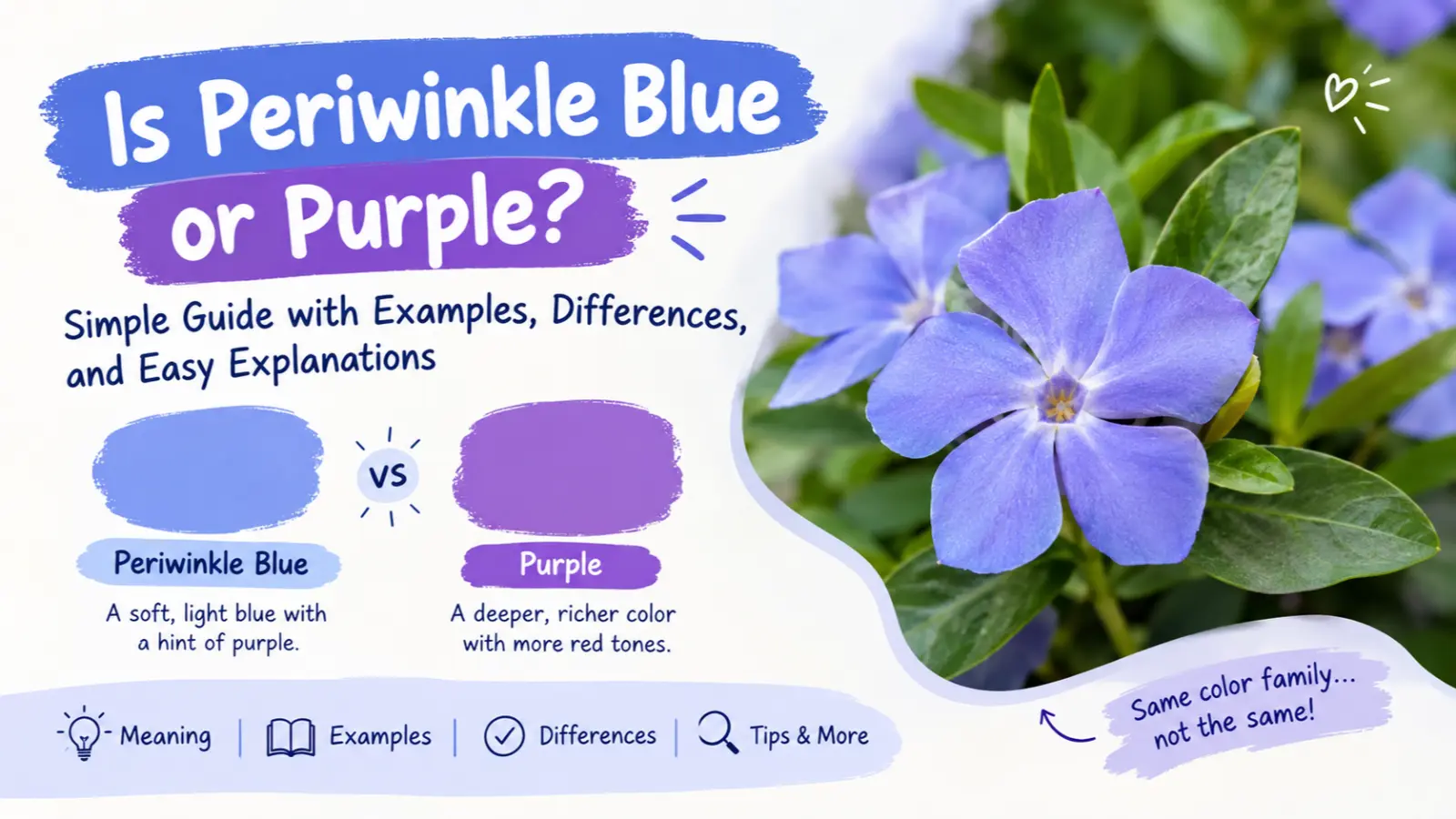
Is Periwinkle Blue or Purple? This is a common question for anyone exploring color trends, fashion, interior design, and creative projects. Periwinkle is a beautiful color that sits between blue and purple, making it difficult to classify at first glance. Its soft, calming appearance has made it a popular choice for clothing, home decor, wedding themes, and digital designs. But which color does periwinkle truly belong to?
Is periwinkle blue or purple? The answer is that periwinkle is a blend of blue and purple. It usually looks like a light blue with a slight purple tint, although some shades appear more purple than blue.
You may see periwinkle in clothing, home decorations, flowers, paintings, and graphic designs. It is also popular on social media, where people use it to create soft, calm, and attractive color themes. Students may come across it in art classes, while designers may use it for websites, logos, and branding.
The confusion happens because periwinkle does not have just one exact shade. Lighting, screen settings, and the colors around it can change how it looks. A pale shade may appear almost blue, while a deeper shade can look closer to lavender or violet.
Understanding this color can help you choose matching clothes, decorate a room, or create better designs. It can also make it easier to explain the difference between blue, purple, lavender, and periwinkle.
In this guide, you’ll learn the meaning, examples, usage, differences, common mistakes, and simple explanations in easy English.
Is Periwinkle Blue or Purple? – Quick Answer
Periwinkle is a light blue-purple color that sits between blue and purple on the color spectrum. It is usually described as a soft blue with a hint of purple, but some versions look more purple.
In simple words:
- Blue periwinkle: A lighter shade that looks mostly blue.
- Purple periwinkle: A shade with a stronger purple or violet tint.
- Classic periwinkle: A balanced mix of soft blue and purple.
Examples:
- A pale periwinkle shirt may look light blue in daylight.
- Periwinkle flowers often show a soft blue-violet color.
- A periwinkle wall can look more purple under warm indoor lighting.
Simple rule: Think of periwinkle as blue and purple working together. Neither color tells the whole story.
The Origin of Periwinkle
The name periwinkle comes from the name of a small flowering plant. Its flowers are often blue, violet, or blue-purple, which helped give the color its name.
The plant’s common name has a long history in English. Over time, people began using periwinkle to describe the flower’s soft color as well as the plant itself.
Today, the color appears in fashion, art, interior design, and digital graphics. Its gentle appearance makes it useful when a design needs color without looking too bright or strong.
Periwinkle has also become popular in online color palettes because it works well with white, gray, pink, and other soft colors.
British English vs. American English Usage
There is no major British and American English difference in the word periwinkle when it refers to the color.
People in both countries use the same spelling and generally understand it as a light blue-purple shade. The exact color may vary between paint brands, clothing labels, and digital color systems.
| Feature | British English | American English | Notes |
|---|---|---|---|
| Spelling | Periwinkle | Periwinkle | Same spelling |
| Color meaning | Light blue-purple | Light blue-purple | Same general meaning |
| Everyday use | Fashion, art, decor | Fashion, art, decor | Similar use |
| Pronunciation | Similar | Similar | Small accent differences may occur |
| Exact shade | May vary | May vary | Depends on the product or color palette |
For example, someone in the UK may describe a dress as periwinkle blue, while someone in the US may call a similar dress periwinkle purple. Both descriptions can make sense if the shade contains both colors.
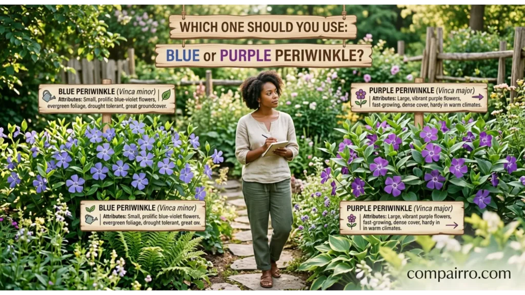
Which One Should You Use: Blue or Purple Periwinkle?
The best description depends on which color stands out most in the shade you are looking at.
Use these simple tips:
- Call it blue periwinkle when the color looks mostly blue with a small purple tint.
- Call it purple periwinkle when the violet or purple tone is stronger.
- Use simply “periwinkle” when you want to describe the color without choosing a side.
- Use a color code when working on a website or digital design and need an exact shade.
- Check the actual product when buying paint, clothes, or decorations because names can vary between brands.
In formal design work, the term periwinkle is useful because it describes a color family rather than forcing every shade into only blue or purple.
For casual conversations, either “blue-purple” or “light blue with a purple tint” is easy to understand.
Common Mistakes With Periwinkle
People often mix up periwinkle with other light shades. Here are five common mistakes and how to avoid them.
Mistake 1: Thinking periwinkle is only blue
❌ Incorrect: Every periwinkle shade is simply light blue.
✔ Correct: Periwinkle usually has both blue and purple qualities. Some shades lean more toward blue than others.
Mistake 2: Thinking periwinkle is always purple
❌ Incorrect: Periwinkle is exactly the same as dark purple.
✔ Correct: Most periwinkle shades are lighter and softer than dark purple. Many have a clear blue appearance.
Mistake 3: Confusing periwinkle with lavender
❌ Incorrect: Periwinkle and lavender are always the same color.
✔ Correct: Lavender usually looks more purple, while periwinkle often has a stronger blue tone.
Mistake 4: Expecting the color to look the same everywhere
❌ Incorrect: Periwinkle will look identical on every screen or in every room.
✔ Correct: Lighting, display settings, surrounding colors, and materials can change how a shade appears.
Mistake 5: Assuming every brand uses the same shade
❌ Incorrect: Every product labeled periwinkle has the exact same color.
✔ Correct: Different brands may use different blue-purple shades under the same color name. Check a sample when accuracy matters.
Periwinkle in Everyday Examples
Periwinkle is easy to recognize when you see how people use it in daily life.
At Work
Designers may choose periwinkle for websites, presentations, and brand graphics. It can add color without making a design look too bold.
Example: “We used periwinkle in the presentation to create a soft, modern look.”
At School
Students may use periwinkle in art projects, posters, and drawings. It can help create smooth transitions between blue and purple.
Example: “I used periwinkle to color the sky in my painting.”
On Social Media
Periwinkle often appears in aesthetic posts, digital illustrations, wallpapers, and themed photo layouts.
Example: “Her social media theme uses periwinkle, white, and pale pink.”
In Daily Life
You may notice periwinkle in flowers, clothes, cushions, notebooks, and home decorations.
Example: “I bought a periwinkle cushion to match my light gray sofa.”
In Text Messages
People may use the word when discussing clothing, design ideas, or favorite colors.
Example:
- Person A: “What color is your new dress?”
- Person B: “It’s periwinkle. It’s somewhere between blue and purple!”
These examples show that periwinkle is a practical color name, not just an artistic term.
Is Periwinkle Blue or Purple? – Google Trends and Usage Data
People may search for “is periwinkle blue or purple” because they want to identify a color, match an outfit, choose paint, or understand a color name.
However, live Google Trends data is needed to confirm which countries search for this exact phrase most often. Without that data, it would be misleading to name a leading country or claim that searches are increasing.
Here are some common reasons people may look up the term:
- United States: Choosing clothing colors, wedding themes, paint, and design palettes.
- United Kingdom: Learning color names and matching home decorations.
- India: Finding color combinations for clothing, invitations, and digital artwork.
- Pakistan: Exploring colors for dresses, graphic design, and social media posts.
- Canada: Choosing home decor, clothing, and creative project colors.
- Australia: Exploring color palettes for fashion, art, and interior design.
These are possible use cases, not verified country rankings.
Search interest may also change with fashion trends, seasonal designs, weddings, and popular color palettes. Beginners often search this question because periwinkle can look different depending on the shade and lighting.
To check current interest, visit Google Trends and compare “periwinkle color,” “periwinkle blue,” and “periwinkle purple.” Select your country and time range to see how search interest differs.
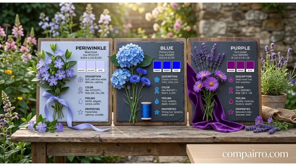
Comparison Table: Periwinkle vs. Blue vs. Purple
Periwinkle belongs between blue and purple, but it is not identical to either one. This table explains the main differences.
| Feature | Periwinkle | Blue | Purple |
|---|---|---|---|
| Main appearance | Blue-purple blend | Blue | Red-blue blend |
| Common look | Soft and gentle | Cool and clear | Rich or violet-like |
| Purple tint | Present | Usually absent or subtle | Stronger |
| Blue appearance | Usually noticeable | Dominant | Varies by shade |
| Common uses | Clothing, decor, art | Clothing, branding, decor | Fashion, art, decor |
| Similar color | Lavender-blue | Sky blue | Violet |
| Overall feel | Soft and balanced | Cool and fresh | Often rich and expressive |
Remember that these are general descriptions. Color names are not always exact, and different shades can overlap.
Periwinkle vs. Lavender

Periwinkle
Usually has a stronger blue tone.

Lavender
Usually has a stronger purple tone.
Both colors are soft and light, so they can be difficult to tell apart at first. The easiest way to remember the difference is that periwinkle often leans blue, while lavender often leans purple.
Periwinkle in Professional Life
Periwinkle can be useful in graphic design, fashion, branding, and interior design. Its soft appearance makes it a good choice for designs that need a calm but colorful look.
Here are some practical uses:
- Graphic design: Add periwinkle to backgrounds, icons, and illustrations.
- Website design: Use it as an accent color with white or gray.
- Fashion: Pair periwinkle clothing with neutral colors for a balanced outfit.
- Interior design: Use it in cushions, artwork, or decorative items.
- Branding: Combine it with suitable colors to create a soft, modern visual style.
Designers should also consider contrast and readability. Very light periwinkle text on a white background may be hard to read. Darker text can make the design clearer.
When a project requires exact colors, use a specific HEX or RGB value rather than relying only on the name periwinkle.

Periwinkle for Students and Beginners
Students may find periwinkle confusing because color names often overlap. There is no single shade that everyone must use when describing it.
These tips can help beginners:
- Compare the colors: Place a blue sample and a purple sample next to the periwinkle shade.
- Look in natural light: Daylight can help you notice whether the blue or purple tone is stronger.
- Learn related names: Compare periwinkle with lavender, violet, lilac, and sky blue.
- Use simple descriptions: Say “light blue-purple” if you are unsure of the exact shade.
- Practice with art: Mix blue and purple paints in small amounts to explore similar colors.
If you are completing a school assignment, describing periwinkle as a light blue-purple color is a clear and accurate starting point.
Signs or Characteristics of Periwinkle
How can you recognize periwinkle? Look for these common features:
- A blue-purple mix: The shade usually contains visible blue and purple tones.
- A soft appearance: Many common periwinkle shades are light and gentle.
- Different levels of blue: Some versions look more blue than purple.
- Different levels of purple: Other versions look closer to violet or lavender.
- Flexible color matching: Periwinkle can work with white, gray, pale pink, and selected green shades.
- Changes under lighting: Warm and cool light can affect how the color appears.
- Use in many settings: It can appear in flowers, fabrics, paint, illustrations, and digital designs.
These features are useful clues, but they do not mean every periwinkle product will look the same.
Simple Trick to Remember Periwinkle
Here is an easy way to remember the color:
Periwinkle = Blue + Purple
Think of it this way: imagine a soft blue color with a little purple mixed into it. That gives you the general idea of periwinkle.
Use this quick comparison:
- Sky blue = mostly blue.
- Lavender = mostly purple.
- Periwinkle = a blend of blue and purple.
For example, if you see a flower that looks light blue from a distance but slightly violet up close, it may remind you of periwinkle.
The key is not to worry too much about choosing only one color family. Periwinkle is known for sitting between the two.
FAQs
1. Is periwinkle blue or purple?
Periwinkle is both blue and purple in appearance. It is usually a light blue shade with a purple tint, although some versions look more purple.
2. Is periwinkle closer to blue or purple?
Many common periwinkle shades look closer to blue, but the exact balance depends on the shade. Some versions have a stronger violet tone.
3. Is periwinkle the same as lavender?
No. Lavender usually looks more purple, while periwinkle commonly has more blue in it. However, some shades can look very similar.
4. What colors make periwinkle?
In paint, mixing blue with a little purple or violet can create a periwinkle-like shade. Adding white makes the result lighter. The exact mix depends on the paints used.
5. Is periwinkle a warm or cool color?
Periwinkle is generally considered a cool color because of its blue and violet tones. However, the exact shade can affect how warm or cool it appears.
6. What colors go well with periwinkle?
Periwinkle pairs well with white, gray, pale pink, cream, and some soft green shades. The best combination depends on the style and the shade you choose.
7. Why does periwinkle look different on different screens?
Screens use different brightness, color settings, and displays. These differences can make the same digital color appear more blue, purple, or gray.
Conclusion
So, is periwinkle blue or purple? Periwinkle is a soft blue-purple color that sits between the two. Many shades lean toward blue, while others have a stronger purple appearance.
You can find this color in flowers, clothes, home decorations, paintings, and digital designs. Its exact appearance depends on the shade, lighting, and surrounding colors.
The easiest memory rule is simple: blue + purple = periwinkle. When you are unsure how to describe it, calling it a light blue-purple color is a clear and beginner-friendly choice.

Sara Taylor is a passionate English content writer who specializes in word meanings, spelling comparisons, and modern slang explanations. She creates easy-to-understand articles that help readers avoid common English mistakes and improve their writing skills. Her content focuses on simple learning, real-life examples, and clear explanations for everyday readers.